SecureEntryHub React Template: Where Security Meets Beautiful Interface Design
Why Your Security Dashboard's Design Matters More Than You Think
Here's a surprising truth: the best security tool becomes useless if your team refuses to use it.
A security analyst staring at a cluttered, confusing dashboard doesn't respond faster to threats. They don't make better decisions. They experience what experts call "interface fatigue"—that mental exhaustion that comes from fighting your tools instead of using them.
This is where UI design becomes a security issue itself.
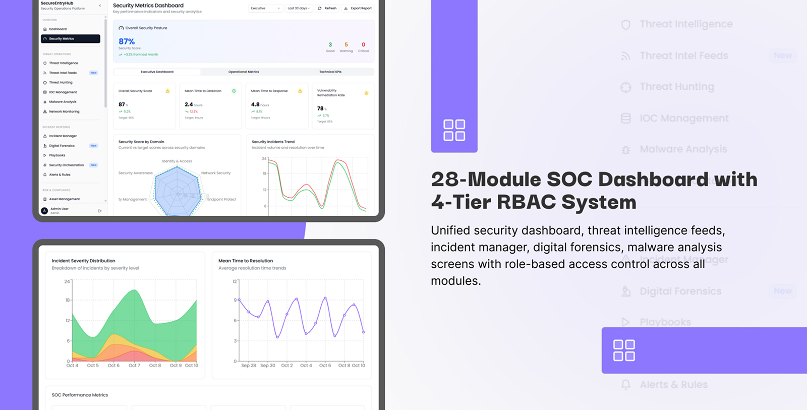
SecureEntryHub isn't just a cybersecurity template built with React. It's a carefully architected interface designed from the ground up around how security professionals actually work. Every pixel, every interaction, every visual hierarchy serves a singular purpose: getting critical information to your team's eyes in the fastest, clearest way possible.
Let's explore what makes SecureEntryHub's UI design stand out in the crowded landscape of admin dashboards.
The Design Philosophy: Form Follows Function
Unlike generic admin templates, SecureEntryHub doesn't prioritize flashy visual effects. Instead, it follows a design-first approach grounded in proven UX principles for security operations centers.
Get a Live Demo
1. Dark Theme Optimized for Security Operations
SecureEntryHub features a professionally-designed dark theme—and this isn't just aesthetic preference. There are concrete reasons why dark-themed dashboards dominate the security industry:
Reduces Eye Strain During Extended Monitoring Sessions. Security analysts spend entire shifts staring at screens. The high contrast between text and dark backgrounds reduces eye fatigue, allowing teams to maintain focus for longer periods. When you're searching for the one critical alert among thousands of events, sustained attention is everything.
Improves Visual Pop for Alerts and Warnings. Against a dark background, critical alerts with red highlights, yellow warnings, and green safe indicators stand out with maximum contrast. This creates an immediate, intuitive visual hierarchy that requires no conscious effort to parse.
Battery-Friendly Display Technology. For security teams monitoring on mobile devices or tablets during incident response, dark themes consume significantly less power—a practical benefit when you need your device to last through a marathon incident.
Increases User Engagement. Research shows dark-themed applications significantly improve user engagement and time-on-dashboard, which directly translates to better security monitoring outcomes.
SecureEntryHub's dark theme isn't just black-on-white inversion. It's a carefully calibrated color palette using deep grays, accent colors, and strategic highlights to guide user attention exactly where it needs to go.
2. Visual Hierarchy: Signal vs. Noise
One of the biggest design challenges in security dashboards is preventing information overload. Your SOC team doesn't need to see every log entry. They need to see what requires action.
SecureEntryHub solves this through intelligent visual hierarchy:
Critical Threats Get Maximum Visual Weight. Active security incidents appear at the top of the dashboard in large, bold cards with unmistakable red indicators. CISO walking by? They immediately understand the current threat landscape in 2 seconds.
Progressive Disclosure Pattern. Rather than cramming all data onto one screen, SecureEntryHub uses expandable sections and drill-down capabilities. Summary-level view first, detailed logs available one click away. This prevents cognitive overload while maintaining access to granular information when needed.
Three-Tier Alert System. Following industry best practices for cybersecurity dashboards, SecureEntryHub implements a three-level alert structure:
Critical threats (top, bold, red, high contrast)
Moderate risks (middle, yellow, collapsible)
Informational logs (bottom, greyed out, low visual weight)
This means analysts naturally focus on what matters without manually filtering noise.
Component Design: Every Widget Has a Purpose
3. Customizable Dashboard Widgets
SecureEntryHub provides extensive modular widget components that go far beyond typical admin templates:
Pre-Built Security-Specific Components:
Real-time threat level indicators
Attack timeline visualizations
Threat maps
Vulnerability risk matrices
Compliance status cards
Incident response workflow panels
User activity
SecureEntryHub enables role-based dashboard customization through intuitive drag-and-drop interfaces. Create unlimited dashboard variations without touching code. Analysts personalize their workspace to match their workflow.
Responsive Widget Design. Every widget scales gracefully from desktop (1920px) to tablet (768px) to mobile (375px). Your security team can monitor incidents from anywhere—in the war room, from home, from the parking lot—and the interface adapts perfectly.
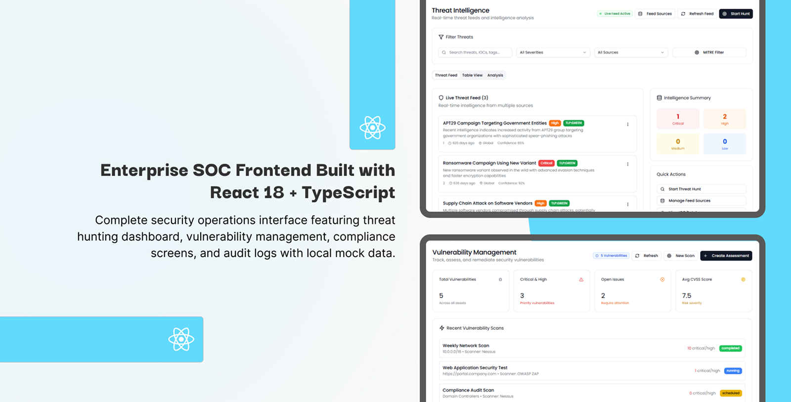
4. Data Visualization That Tells a Story
Raw numbers don't drive action. Visualizations do.
SecureEntryHub integrates advanced charting libraries designed specifically for security data:
Timeline Visualizations. See attack patterns across hours or days. Notice that spike at 2 AM? The interface immediately highlights it. Your team asks "why?"—the first question of any good investigation.
Threat Maps. Real-time world map showing where attacks originate. One glance tells you: are these distributed attacks or focused on a specific region? This single visualization can shift your entire incident response strategy.
Risk Matrices. Not all vulnerabilities are equal. SecureEntryHub uses color-coded matrices to show risk concentration. Green boxes (low risk) fade into the background. Red boxes (critical vulnerabilities affecting high-value assets) demand attention.
Flow Diagrams and Network Topology. Understand your network architecture at a glance. See how threats propagate. Visualize lateral movement in real-time.
All these visualizations use color-blind friendly palettes, ensuring no information is conveyed solely through color. Icons, patterns, and labels work alongside colors to maintain clarity for all team members.
Navigation & Interaction Design: Frictionless Security Operations
5. Intuitive Navigation Architecture
Complex security systems need complex navigation. But SecureEntryHub proves that complexity doesn't require confusion.
Sidebar Navigation with Smart Organization. Security-relevant categories naturally group related functions:
Threat Detection & Response
Vulnerability Management
User & Access Management
Compliance & Reporting
System Configuration
Rather than alphabetical menus, categories reflect how security professionals think about their work.
Breadcrumb Trails for Context Preservation. You drill into a specific incident. You need to know where you are in the dashboard hierarchy. Breadcrumbs show your path: Incidents → Network Threats → DDoS Attack → Source Analysis. One click returns to any level.
Consistent Interaction Patterns. Whether you're filtering threat data, expanding logs, or running reports, the interaction patterns remain consistent across the entire interface. Your team doesn't need to relearn interactions—muscle memory works.
6. Search and Filter: Find What You Need Instantly
Security incidents don't follow predictable patterns. Your dashboard needs intelligent search and filtering.
SecureEntryHub includes:
Advanced Search. Full-text search across all security events, logs, and metadata. Search for IP addresses, domains, usernames, threat signatures—anything your investigation requires.
Responsive Design: Security Monitoring Anywhere
7. Desktop-First, But Mobile-Ready
Most security dashboards are designed for desktop only. But modern incident response happens everywhere.
SecureEntryHub implements mobile-first responsive design:
Simplified Mobile Layouts. Touch-friendly buttons (minimum 44px size to prevent accidental clicks). Stacked layouts eliminate horizontal scrolling. Critical alerts remain visible at the top of the screen.
Touch-Optimized Interactions. Tap targets sized for human fingers, not mouse cursors. Swipe gestures for common actions. Long-press for additional options.
Accessibility: Security for Everyone
8. WCAG Compliance Built-In
SecureEntryHub doesn't just look good—it's designed for everyone, including team members with disabilities.
Color-Blind Friendly Design. Avoid relying solely on color to convey threat severity. SecureEntryHub uses icons, labels, and patterns alongside colors. A color-blind analyst understands the threat landscape as clearly as anyone else.
Screen Reader Compatible. Critical alerts, reports, and navigation elements work with assistive technology. Semantic HTML and ARIA labels ensure blind users can navigate independently.
Keyboard Navigation Support. Use Tab, Enter, and arrow keys to navigate the entire dashboard without touching the mouse. Keyboard shortcuts for common actions. No accessibility afterthought—it's built into the architecture.
Adjustable Contrast & Typography. Users can increase contrast levels for better readability. Font sizes adjust without breaking layouts. High contrast mode turns all text bold for better visibility.
Performance Design: Fast Is a Feature
9. React Architecture Optimized for Speed
Security teams don't tolerate slow dashboards. Every millisecond matters during incident response.
SecureEntryHub builds on modern React best practices:
Code Splitting & Lazy Loading. Dashboard pages load only the components you need, immediately. Background lazy-loading ensures nearby pages load seamlessly. No waiting for unrelated security features to render.
Memoization & Performance Optimization. React hooks prevent unnecessary re-renders. When one threat indicator updates, it doesn't trigger a full dashboard redraw. Real-time data streams stay smooth even with thousands of concurrent updates.
Efficient Data Handling. Virtual scrolling for massive data tables. You have 50,000 security events? The table only renders visible rows. Scrolling remains silky smooth.
Customization Without Code: The Template's Superpower
10. Theme Configuration
Your brand has specific colors. Your security team prefers specific alert styles. Your compliance requirements demand specific report formats.
SecureEntryHub's modular design makes customization intuitive:
SASS-Powered Theme Variables. Adjust the entire color palette by modifying a handful of variables. Change primary color from blue to your corporate teal—every component updates automatically.
Component Library Approach. Every UI element—buttons, cards, tables, charts—is a reusable component following Material Design principles. Mix, match, and combine for unlimited customization.
The UX Strategy: Reducing Cognitive Load
Why This Design Matters in Real Security Incidents
Let's ground this in reality. Your team discovers a potential breach at 11 PM. Alerts are flooding in. Stress levels are maxed out. Decision-making quality drops with every passing minute.
In this moment, your dashboard's UI design becomes literally life-or-death for your business.
Poor UI design adds stress. Analysts fight confusing interfaces. They miss critical details buried in noise. Response time suffers. Breach impact multiplies.
Good UI design removes friction. Information appears exactly where expected. Visual hierarchy guides attention automatically. Your team spends cognitive energy on analysis, not interface navigation.
SecureEntryHub's design philosophy is that great security UI is invisible. Your team focuses entirely on the security problem, not the tool. The interface disappears. Only the data matters.
Industry Standards Meet Practical Reality
SecureEntryHub follows established UI/UX best practices for cybersecurity dashboards:
✅ Prioritizes critical insights over raw data—actionable intelligence beats information overload
✅ Implements intuitive visual hierarchy—important information gets maximum visual weight
✅ Enables role-based customization—different jobs, different dashboard views
✅ Supports mobile & tablet monitoring—incident response happens everywhere
✅ Maintains accessibility standards—security tools work for all team members
✅ Implements predictive analytics integration—proactive not just reactive monitoring
✅ Includes RBAC & authentication—the dashboard itself is secure
The Bottom Line: Design Is Security
When security teams select admin dashboards, they often focus on features: "Does it integrate with SIEM tools? Does it handle real-time data? Does it generate compliance reports?"
But the real differentiator is how those features are presented.
SecureEntryHub isn't just feature-complete. It's beautifully designed for the unique requirements of security professionals. Every interface decision—from color palette to widget customization to responsive layouts—serves security teams' actual workflows.
Your dashboard shouldn't make security harder. It should make security faster, clearer, and more effective.
That's what SecureEntryHub's UI design delivers.
Get a Live Demo
